
Published by UK Bricks & Slips ·
Start with the fixed finishes in the room
Lay out samples of the flooring, cabinets, worktop or paint beside a shortlist from the brick slips range. Decide which element should attract attention. If the floor already has strong variation, compare a quieter-looking wall sample; if the other finishes are plain, you may prefer a blend with more visible contrast.
Treat colour family labels as navigation, not an exact specification of every face. Names such as “Antique” or “Weathered” describe products; they are not evidence of reclaimed origin. Product images help you choose candidates, but lighting and screens affect reproduction. Check physical samples and the intended mortar before agreeing the final appearance.
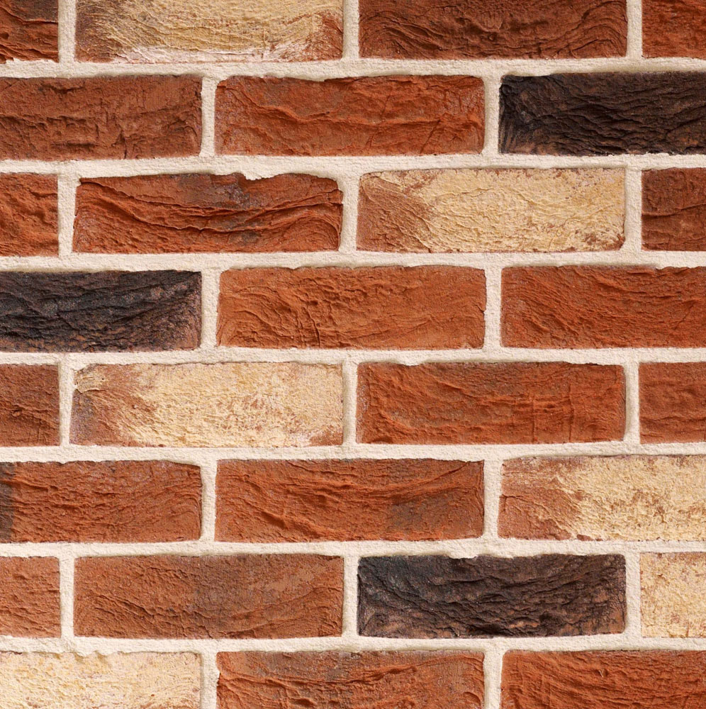 TBS Traditional Red Blend Brick Slips
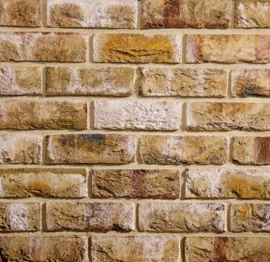 TBS London Weathered Yellow Brick Slips
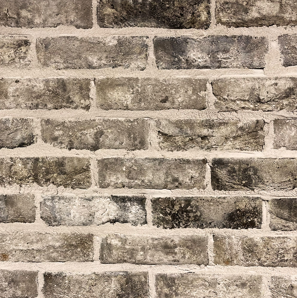 TBS Iced Grey Brick Slips
Red and brown: compare the blend, not just the label
For red, compare TBS Traditional Red Blend with TBS Audley Antique. Both sit in the red family in our catalogue, yet a family label is not enough to choose between them. Look at the range of faces, edges and markings in the product images, then ask to see a representative sample.
TBS Rustington Antique is a brown family option if you want to explore a different relationship with timber or painted joinery. As a design trial, put each candidate beside the same cabinet door and a compatible mortar sample. Record whether the wall or the furniture becomes the dominant element. There is no universal rule that a red must use a pale joint or a brown must use a dark one.
Yellow and buff: check the neighbouring undertones
Compare TBS London Weathered Yellow and TBS Daneshill Yellow for yellow family possibilities. For buff, investigate TBS Mystique or TBS Highgrove Yellow; the latter is classified as buff in the catalogue despite “Yellow” in its name.
This is a good reason to examine the actual finish rather than shopping by a name alone. Put the samples beside oak, cream-painted furniture or the floor you intend to keep and judge the combination in place. A pairing that looks harmonious on a desk may feel too similar or too contrasting when spread across the room.
Grey and cream: let light and texture take part
For grey, shortlist TBS Iced Grey and TBS Normandy Grey Blend. For cream, compare TBS Shelford Cream Multi with TBS Sandalwood. These are current product examples, not promises of identical tone within each family.
Check them under the lighting you use most. A sample close to the window may be lit very differently from one behind a television or in an alcove. Look at texture from the side as well as colour from the front. If your aim is a restrained backdrop, inspect the joint contrast too: a pale slip with strongly contrasting mortar can still make a very pronounced grid.
Choose joint colour and profile with the slip
The BDA’s aesthetic guidance explains that mortar makes a significant contribution to the visible wall. A useful trial is to compare a closer-toned joint with a contrasting one while keeping the slip and lighting unchanged. This reveals whether you prefer the overall blend or the outline of each piece to lead.
Colour choice follows compatibility. The stocked UltraScape Cempoint mortar is one product to review against its current instructions and the proposed system; confirm available colours rather than assuming every shade is supplied. Read the pointing and mortar guide before agreeing the joint finish.
Keep joint width and profile consistent in each comparison unless those are the variables you are deliberately testing. Assess a trial made with the actual materials once it is ready for evaluation under their instructions. A digital colour block or fresh wet mortar is not the final reference for the finished wall.
Record one complete combination before ordering
Use the sample comparison guide to note the exact product, mortar, joint, lighting and adjacent finishes. Photograph the arrangement for reference while retaining the physical sample. Ask about the variation to expect across the order, especially when a small number of faces influenced the decision.
For a practical shortlist, test two slips with one mortar first. Then compare two compatible mortar options with the preferred slip. This keeps the choice manageable and shows which change produced the result you liked. Share the accepted trial with the installer rather than relying on a phrase such as “warm rustic brick”.
Next, explore patterns and bonds if the layout is undecided, or use the brick slips overview to connect the appearance choice to preparation and ordering. The finished brief should identify a reproducible combination, with sample limitations understood, rather than a colour name in isolation.
Sources and product guidance
Use the current instructions for your chosen product and complete installation. The sources below support this guide; they do not approve every product combination.
Find a finish for your project
Compare the brick slips range, check product details and sample options, or tell us about the wall you are planning.